Independent screens
Upload, crop, and position a different screenshot for each device.
Cross-device products and responsive design
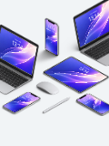
Combine iPhone, iPad, and Mac devices on one canvas to present a consistent product, website, or wallpaper experience across screen sizes.
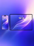
Choose phone-and-tablet, phone-and-desktop, multi-device rows, and scene compositions, with separate uploads for every screen and one shared background.
Open mockup editor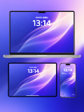
What you can do
Upload, crop, and position a different screenshot for each device.
Control background, spacing, and canvas once for a consistent set.
Present mobile, tablet, and desktop interfaces side by side.
Use cases
Workflow
Open the editor and select a Multi-device mockups template.
Upload a screenshot, wallpaper, or design, then refine the crop, device, background, and text.
Choose a canvas ratio, image format, and export scale, then download the finished mockup.
FAQ
Yes. Multi-device templates allow separate images and adjustments for every screen.
Yes. Add phones, tablets, and computers through device management in the editor.
Yes. It is designed to show a website layout across phone, tablet, and desktop screens.